A lash technician Instagram logo
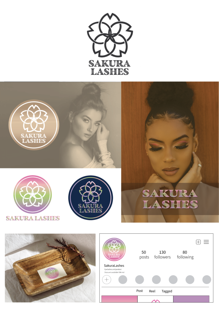
個人でラッシュエクステンションをしている方からの以来でした。ビジネス名は「Sakura Lashes」で、クライアント様から、日本の家紋を取り入れ、日本ならではの高い技術力と、きめ細やかなおもてなしを表現したデザインにしたいというご要望がありました。
The business is named Sakura Lashes, and the client proposed the idea of incorporating a Japanese kamon style to emphasize specialized Japanese techniques and exceptional hospitality for her clients.
symbol : Simple and catchy, not overly traditional, yet unmistakably inspired by Japanese kamon style.
Typography : Soft and feminine typography was used to reflect her work style and aesthetic.
制作過程
5つのデザイン案を制作し、そのうち2案は日本の家紋の要素を強く取り入れたもの、残り3案は家紋の雰囲気をやわらかく表現し、フェミニンなカラーを用いたデザインとしました。クライアント様の顧客層の多くが女性であることから、より柔らかいデザインが選ばれました。また、Instagramの検索画面でどの背景色が目立つかを検討し、視認性とプロフィール画面上でのバランスを高めるため、グラデーションの方向や文字配置を調整しました。
Design Pregress
Five designs were developed—two with a bold kamon influence and three softer, feminine interpretations. The softer option was selected to better align with her female clientele. After reviewing Instagram search results, the gradient direction and text placement were refined to improve visibility and balance on the profile page.
More logo designs